

01
Write a one-sentence promise
A strong poster communicates genre, protagonist, and unusual situation before it explains plot. Write that promise first, then choose the one image that makes a viewer curious.
Anime movie poster generator
Build an original key visual with strong hierarchy and deliberate space for final typography.
The starter prompt creates the illustrated key art and deliberate title space. Replace the subject, genre, lighting, and visual hook before designing the final type elsewhere.
Higher-detail generation for paid plans
Example outputs
What one focused input can produce
Standard image
Advanced image
Output
one 1024 × 1024 raster poster concept with composition and negative space for later typography
Best for
short-film pitches, fictional movie concepts, event art, playlist covers, campaign moodboards, and social announcements
Not designed for
accurate title typography, theatrical print specifications, licensed franchise posters, or press-ready billing blocks
A poster must communicate one focal subject, one mood, and one reason to look closer before credits or decorative detail are added.
01
A strong poster communicates genre, protagonist, and unusual situation before it explains plot. Write that promise first, then choose the one image that makes a viewer curious.
02
Negative space is not an afterthought. State where the title and credits will live, keep important faces away from those zones, and generate without fake text so a designer can finish the hierarchy cleanly.
03
Contrast a small protagonist with a large weather system, machine, creature, or landscape. This gives the poster narrative tension without crowding it with every member of the cast.
01
Write genre, protagonist, conflict, and emotional tone in one sentence.
02
Translate that sentence into one subject, one setting, and one visual contradiction.
03
Reserve clean areas for title, release details, and credits before generation.
04
Vary framing or scale while keeping the same story premise and palette.
05
Add exact type, logos you own, credits, contrast checks, and output dimensions in an editor.
“Anime film poster art: an astronomer in a desert observatory sees a second moon cracked like glass, small figure, vast sky, pale cyan and rust palette, empty lower band for title, no text.”
Why it works: The impossible second moon carries the hook, while the tiny figure establishes scale and genre.
“Anime drama poster art: an elderly tailor sits inside a closed theater holding one unfinished costume, afternoon dust, empty red seats receding behind, quiet symmetrical framing, blank title area.”
Why it works: A single object and empty location imply history without turning the poster into a plot summary.
“Anime adventure poster art: a botanist climbs the roots of an airborne forest while a storm approaches, sweeping vertical motion, emerald and violet, character in lower third, clear sky for title.”
Review composition, title placement, billing copy, rights, print dimensions, and platform crops as separate production decisions.
A movie poster has to communicate genre, protagonist, and central tension in a glance. Choose one dominant image relationship: a small figure against an enormous threat, two faces divided by a symbolic object, or a single silhouette entering an unfamiliar world. Keep secondary characters subordinate unless the story is genuinely an ensemble. The prompt should describe where the eye lands first, what is discovered second, and where the title will eventually sit. Visual hierarchy matters more than the number of effects.
Reserve negative space deliberately instead of hoping typography will fit later. Name the title zone, credit zone, and any crop-safe area in the prompt, then reject results that fill those spaces with faces or critical props. Test a thumbnail early: if the main silhouette and conflict disappear at small size, simplify the background or strengthen value contrast. A poster that only impresses at full resolution will struggle on streaming cards, social previews, and mobile listings.
Movie titles, dates, names, and billing details should be added manually for accuracy and hierarchy.
The output is not automatically a theatrical one-sheet ratio. Plan a crop or outpaint in your design workflow.
A 1024-pixel concept is useful for ideation and digital tests, not large-format press delivery.
Many faces and story objects compete at thumbnail size. Build around one dominant read.
Reviewed 2026-07-22 · Anime Maker product and editorial team
Page illustrations are editorial examples, not live account task logs. Judge the tool by the result shown in your own output panel.
You should generate the illustration without words and add the title afterward. Image-model typography can contain incorrect letters and inconsistent spacing.
The current output is a 1024 × 1024 raster image. It is a concept asset rather than a print-ready theatrical one-sheet.
Name the protagonist, the unusual story signal, the relative scale, camera framing, palette, light direction, and where negative space should remain.
Generate the illustration first, remove text-like artifacts, and finish the title and credits in a layout tool.
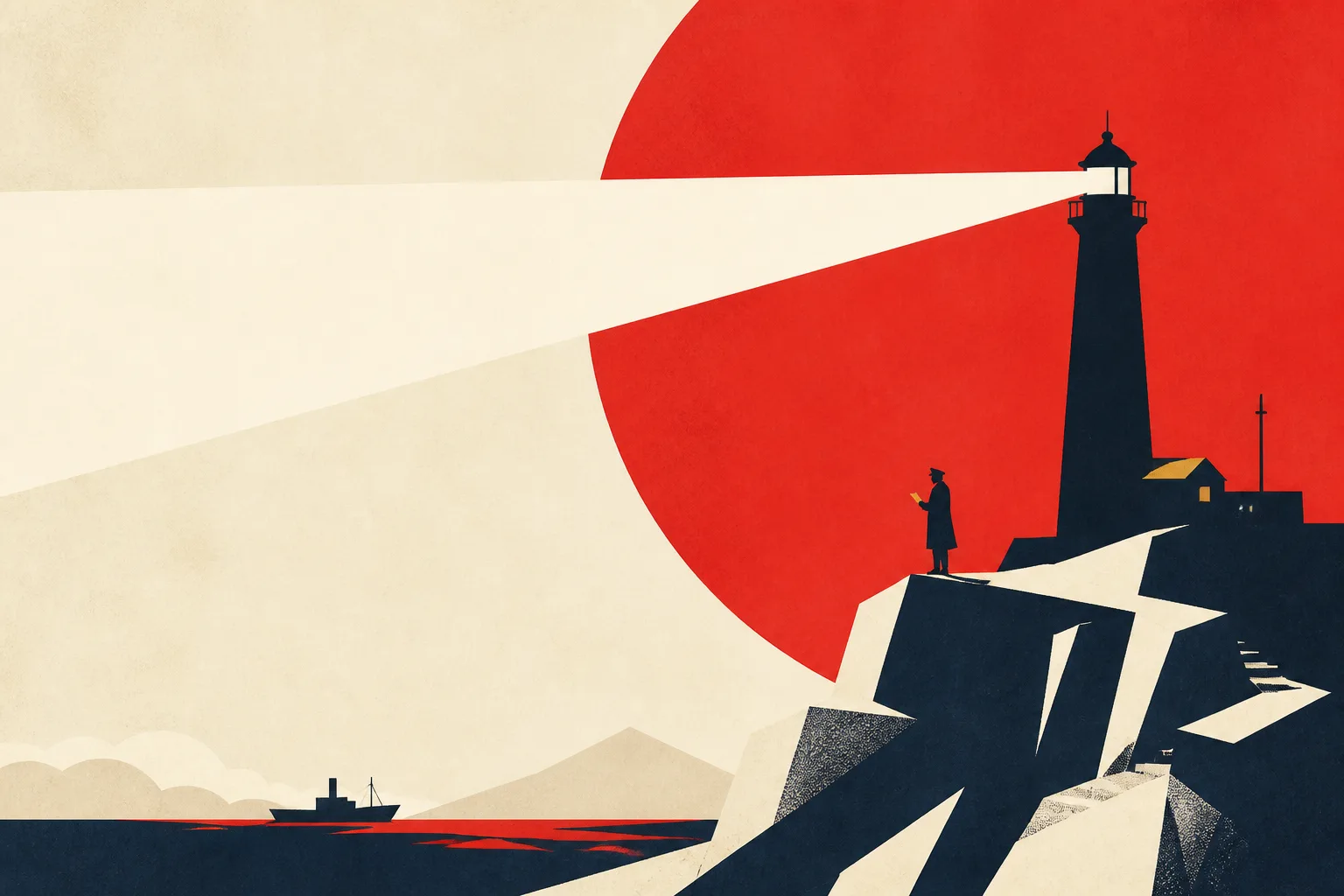
Create poster key artFlat color, one large symbol, and a wide ivory type zone make this useful as a poster foundation rather than a finished typeset design.
Why it works: The diagonal action and approaching weather create forward motion while preserving a usable type zone.
Generate the illustrated foundation without a final title, release date, studio mark, or credit block. Image models can produce convincing letter-like shapes, but exact names and legal lines require a layout tool. After choosing the art, remove accidental characters and rebuild typography with licensed fonts. Match type scale and spacing to the image hierarchy rather than placing a large title wherever space remains. This two-stage process is faster than repeatedly regenerating otherwise strong artwork because one word is malformed.
Use color and texture to support genre without copying an existing franchise. A restrained indigo and amber palette can suggest mystery; hard red accents and diagonal shadows can imply danger; soft mineral colors and open sky can support a reflective drama. Describe visible properties instead of naming a living artist or protected film. Original art direction is easier to refine, easier to explain to collaborators, and less likely to create a poster that looks misleadingly official.
A theatrical one-sheet, streaming thumbnail, horizontal banner, and social teaser do not share the same composition. Start with the placement that carries the most important launch message, then derive variants around the same protagonist, palette, and symbolic element. The current square output is useful for concept approval, but expect to crop, extend, or rebuild the composition for final ratios. Keep key faces and props inside a central safe area when several crops will be required.
Before release, inspect anatomy, background symbols, accidental logos, text-like marks, and anything that could imply a real studio or endorsement. Confirm rights to every reference and avoid protected characters or title treatments. Save the untyped artwork, final layout file, prompt, and edit notes separately. That record supports later localization and makes it clear which parts were generated, retouched, or designed by hand.
Build a small placement sheet before approving the concept: one tall poster, one landscape banner, one square social tile, and one tiny thumbnail. Place temporary real-length title and credit text on each version. This reveals whether the illustration has enough quiet space and whether the central symbol survives aggressive crops. If every placement requires a different focal image, return to the art direction and simplify the premise instead of forcing one composition to perform four unrelated jobs. Check the title at thumbnail size before approval, and repeat the test with the longest localized title.
Create the typography system with real production copy, not placeholder words. Set the final title, longest actor or character name, release line, billing block, rating or festival marks, and any required legal text in a layout application. Test at least three title arrangements against the same illustration: integrated with the environment, separated in a quiet field, and cropped partially behind a subject when readability permits. Check letterforms at thumbnail size and at the largest intended print size. Generated text-like marks should be removed before this stage. A strong title treatment must remain legible without pretending to be part of a real franchise, studio identity, or award campaign.
Write a placement specification before exporting. Record the required aspect ratio, pixel dimensions, color space, bleed, safe area, maximum file size, and expected viewing distance for each destination. Social tiles, streaming cards, print posters, and venue displays fail in different ways. A face that dominates a phone thumbnail can feel oversized on a wall; fine atmospheric detail that rewards print may disappear in an app grid. Build each derivative from the layered design file, not by repeatedly compressing a previous JPEG. Keep the illustrated master, type layers, logos you are authorized to use, and delivery versions separate so later revisions do not degrade the artwork or overwrite the clean source.
Run a campaign consistency review across every crop. The protagonist, symbolic object, palette, and genre signal should remain recognizable even when the composition changes. Do not solve a horizontal banner by simply cutting off half the cast, or solve a square tile by shrinking the entire one-sheet until the title becomes unreadable. Reframe around the same campaign idea and allow secondary information to change priority. Place all versions on one board and view them at their expected display sizes. If they look like unrelated projects, strengthen the shared color, typography, or symbol. If they look mechanically identical, let each placement use its available space more intelligently.
Check accessibility and truthful presentation before approval. Maintain sufficient contrast between title and artwork, avoid placing essential copy over high-frequency textures, and do not communicate release status or warnings through color alone. Write alt text that names the depicted premise and important text rather than praising the visual style. Confirm that generated faces, uniforms, landmarks, seals, laurels, and logos do not imply a real person, institution, festival selection, or endorsement. A concept poster should be labeled as a concept when it could otherwise look official. The more convincing the campaign treatment becomes, the more important it is to distinguish a fictional study from an announced production.
Use an approval checklist that separates illustration problems from design problems. Illustration review covers anatomy, perspective, lighting, background symbols, accidental text, and source similarity. Design review covers hierarchy, title accuracy, credits, legal lines, crop safety, color output, and placement requirements. Assign each issue to the correct file and owner rather than regenerating artwork to fix a kerning error or masking a broken hand with a release badge. Archive the approved version number, prompt, source references, edit history, fonts, and export settings. This record supports localization, later campaign updates, and a clear explanation of which visual elements were generated or manually designed.
Complete a proof cycle before delivery. For print, inspect a correctly sized physical proof for dark shadows, saturated colors, fine legal text, trim risk, and unexpected shifts between screen and paper. For digital placements, test the real asset inside the app, storefront, or social preview rather than on an empty artboard. Verify title spelling, dates, names, credit order, ratings, calls to action, tracking links, and accessibility text against an approved source document. Ask a reviewer to check facts without relying on the designer’s memory. Lock the approved illustration and type files, then export each placement from that version. A poster can look finished while carrying one incorrect date or misleading mark; production accuracy is part of the design, not an administrative step after it.
When the campaign ends, archive a compact performance record beside the design files. Note which placements were used, whether any crop or title treatment had to be replaced, and which thumbnail remained readable at the smallest size. Do not claim that one visual caused a marketing result without controlled evidence, but preserve observable lessons such as repeated mobile truncation or localization overflow. These notes help the next poster begin with tested safe areas, realistic text lengths, and a clearer hierarchy rather than repeating preventable production errors.
Do not request existing characters, studio marks, or a deceptive official campaign. Keep the film, cast, and branding original.
This workflow is designed for original film concepts. Using protected characters, titles, studio marks, or misleading official branding may create legal and platform risks.
Test several genuinely different compositions: close portrait, environmental scale, and symbolic still life. Judge them at thumbnail size before refining one direction.
Not for large-format professional printing. Rebuild type as vectors, verify image resolution, convert color correctly, add bleed, and follow the printer’s specifications.