

01
Write a beat sheet before a prompt
Give every panel one job: establish, complicate, react, or resolve. A panel list is more controllable than a paragraph of plot because it tells the model what must change and what must stay fixed.
Comic strip maker
Turn one story beat into a clear three- or four-panel visual sequence.
The starter prompt assigns one job to each panel. Replace the cast, setting, and final beat while keeping the sequence short enough to read at a glance.
Higher-detail generation for paid plans
Example outputs
What one focused input can produce
Standard image
Advanced image
Output
one 1024 × 1024 raster image containing a three- or four-panel sequence
Best for
story pitches, classroom examples, social posts, campaign concepts, and early visual storyboards
Not designed for
editable panel files, reliable long dialogue, print-ready lettering, or automatic multi-page comic production
A useful comic strip needs a clear setup, turn, and payoff. Art direction supports that reading order instead of competing with it.
01
Give every panel one job: establish, complicate, react, or resolve. A panel list is more controllable than a paragraph of plot because it tells the model what must change and what must stay fixed.
02
Name the same coat, hairstyle, prop, and color in the prompt. Repetition is useful here; it reduces the chance that the protagonist quietly changes between panels.
03
Ask for empty balloons or caption space rather than exact sentences. Generated text can be misspelled or malformed. Add final dialogue after export where you can control wording and accessibility.
01
Choose a setup and a payoff that can be understood in seconds.
02
State clothing, silhouette, palette, and the prop that must survive every panel.
03
Assign a shot, action, and emotional change to each numbered panel.
04
Leave deliberate negative space and avoid depending on generated words.
05
Check reading order and continuity, then add dialogue, credits, and alt text externally.
“Three panels: a cat guards an empty box, a delivery arrives, then the cat ignores the new toy and sits in the shipping carton. Same orange cat, clean gutters, no text.”
Why it works: The cause-and-effect sequence is visual, so the result does not depend on legible dialogue.
“Four panels showing a commuter finding a refill station, scanning a bottle, refilling it, and leaving with less plastic waste. Consistent teal bottle and jacket, blank caption space.”
Why it works: The object and action repeat, which makes the strip easier to scan in a campaign or presentation.
“Four noir comic panels: a courier enters an empty station, sees a red umbrella, hears footsteps, and discovers a child returning it. Monochrome scene with one red accent.”
Open the stage you are working on—story rhythm, continuity, lettering, export, or accessibility—and apply it to the current draft.
A short comic works when the reader can understand what changes from panel to panel without needing an explanation underneath it. Begin with a single dramatic turn: a delivery arrives, a secret is noticed, a plan fails, or a misunderstanding is resolved. Assign one visible event to each panel and remove any beat that only repeats information. For a four-panel strip, a dependable sequence is context, complication, reaction, and payoff. That structure is not a rule, but it forces the prompt to describe observable changes rather than summarize an entire plot.
Write the panel list before choosing rendering adjectives. Identify the shot size, the subject performing the action, and the detail that carries the reader forward. A wide shot can establish the location; a medium shot can clarify an interaction; a close-up can reveal the clue or reaction. Varying the framing creates rhythm while repeated props and clothing preserve continuity. If two panels could be swapped without changing the story, their jobs are probably not distinct enough yet.
The download is a flattened image, not a comic project with movable frames, balloons, or characters.
Use blank speech areas and add exact dialogue in Canva, Figma, Photoshop, or another lettering tool.
Faces, hands, props, and costumes may drift. Keep the cast small and regenerate when a key anchor changes.
A square composition has limited room. One location and one story turn are safer than several scenes.
Reviewed 2026-07-22 · Anime Maker product and editorial team
Page illustrations are editorial examples, not live account task logs. Judge the tool by the result shown in your own output panel.
No. It returns one flattened square image. You can crop or rebuild the panels in an external editor, but this page does not provide layered panel editing.
It may render text-like marks, but exact spelling and punctuation are not dependable. For publishable work, request empty space and letter the strip after download.
Three or four panels are a practical fit for the square output. More panels reduce room for faces, actions, and readable composition.
Start with three or four panels, keep the cast small, and reserve exact dialogue for the editing pass.
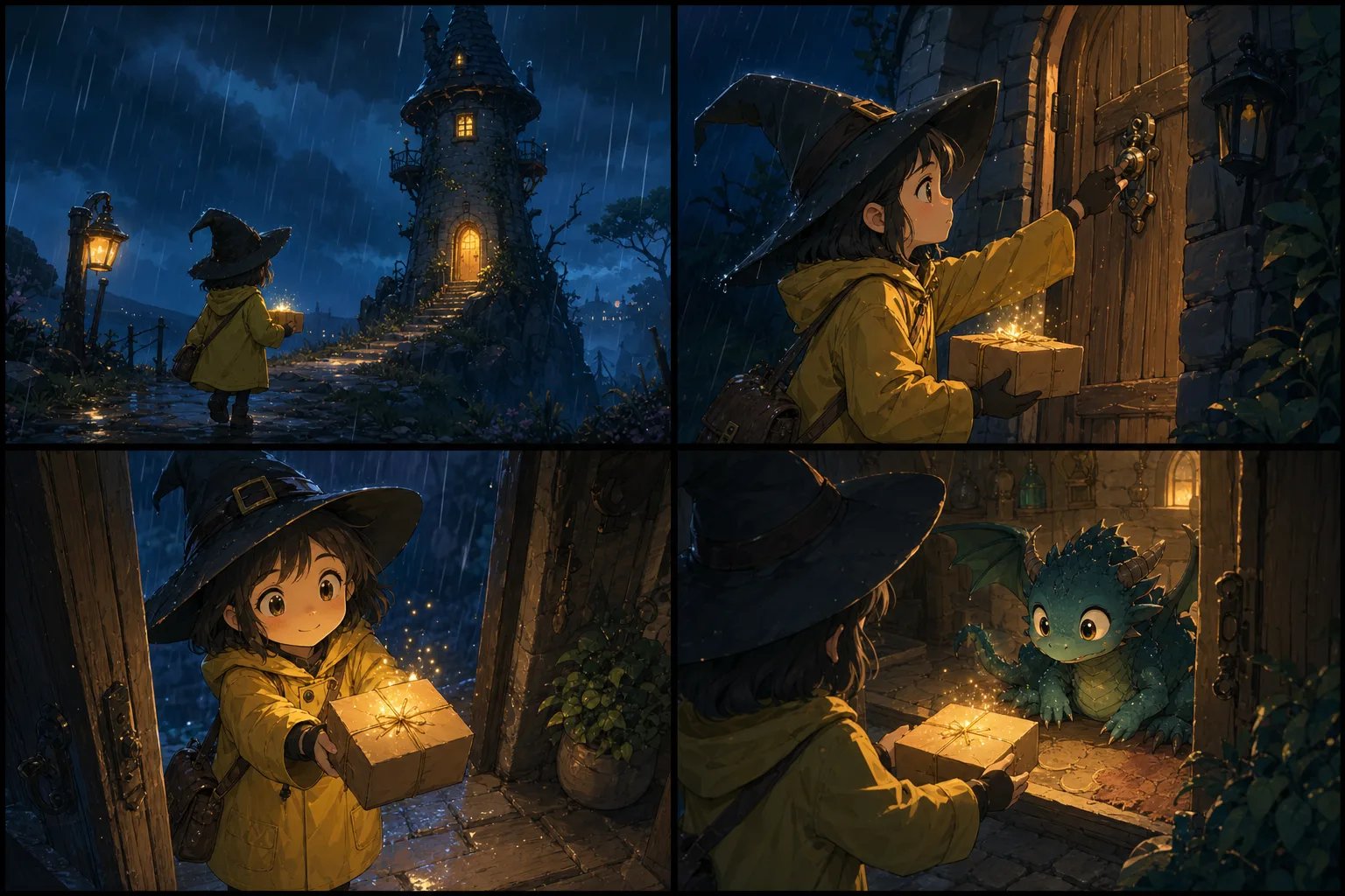
Draft a comic stripOne character, one recurring parcel, and four camera beats create a readable sequence without relying on generated dialogue.
Why it works: A limited palette and one recurring prop give continuity without asking the model to manage a large cast.
Continuity depends on a short list of anchors that are easy to see: coat color, hairstyle, body silhouette, signature prop, and one stable environmental feature. Repeat those anchors in the numbered panel instructions instead of assuming the model will remember them. Keep the cast small and avoid simultaneous costume, weather, and location changes. When a face or prop changes enough to affect the story, regenerate the art rather than trying to hide the mistake under dialogue.
Treat dialogue as editable design, not baked-in artwork. Ask for clear negative space, empty balloons, or caption zones, then add the final text in a comic or layout editor. This gives you control over spelling, font, reading order, translation, and accessibility. Keep each balloon attached to one speaker and avoid crossing tails. Read the finished strip at phone size; if the sequence only works when enlarged, simplify the panel composition or shorten the copy.
The downloaded image is a visual draft, so inspect gutters, panel order, faces, hands, repeated props, and the amount of usable text space before adding polish. Crop only after confirming that the crop will not break the sequence. For social publishing, test the strip in the actual feed width and prepare alt text that describes the action and final beat rather than listing decorative details. Keep an unlettered copy so translated or revised dialogue can be added without repainting the art.
For recurring strips, maintain a compact character sheet outside the generator: front and side views, palette values, clothing notes, scale relationships, and a few approved expressions. Save the prompt that produced the closest match and record what was corrected later. Independent generations will still vary, but this reference package makes the next brief more precise and gives a human editor a consistent target. A series becomes reliable through documented decisions, not through one unusually successful generation.
Run one final reading test with someone who has not seen the prompt. Ask them to describe the order of events, identify the speaker in each balloon, and explain the payoff. If they need the original story summary, the art or lettering is carrying too little information. Fix the earliest point of confusion rather than adding explanatory copy to every panel. Also check color contrast, minimum type size, and alt text before export so the strip remains understandable beyond the full-size desktop view.
Build the lettering file as a separate production layer. Import the unlettered strip into a layout editor, lock the artwork, and create distinct layers for balloons, tails, captions, sound effects, and final dialogue. Set one body typeface, one emphasis treatment, and a small range of text sizes before placing the first line. This prevents every panel from developing its own visual language. Fit the longest translation early, because a balloon designed around a short English phrase may not hold German, Spanish, or another expanded version. Keep generous internal padding, avoid placing type against balloon edges, and never shrink one line until it becomes unreadable merely to preserve the original shape. If the dialogue does not fit, shorten the wording or redraw the balloon while the text remains editable.
Prepare exports around the actual destination rather than one universal image. A square social post may show the complete strip, while a narrow mobile feed may require each panel as a separate slide. Export a full-resolution archival version, a web-sized version with controlled compression, and any panel-by-panel carousel assets. Confirm that gutters remain visible after platform resizing and that no panel edge is mistaken for the edge of the post. Add a concise caption that provides context without repeating the punchline, and write alt text in reading order. If the strip contains essential dialogue, include that dialogue in the alt text or an adjacent transcript so screen-reader users receive the same story information rather than a vague description of the art style.
For a recurring series, separate what must stay fixed from what should change. Character anchors, balloon style, type system, gutter width, and export dimensions belong in a small series guide. Camera angle, setting, color mood, and panel rhythm can then change to serve each episode. Review two or three completed strips side by side: inconsistent coat colors, eye shapes, prop scale, or caption placement are easier to see across a contact sheet than inside one episode. Reuse approved design decisions, not whole prompts that contain irrelevant scene details. A compact record of successful wording and manual corrections saves more time than attempting to force every new idea through one increasingly long master prompt.
Treat comedy timing as an editing decision. The final panel should not be visually announced too early by a unique border, much brighter color, or oversized subject unless that reveal is intentional. Use reaction shots, repeated framing, or a small pause panel to control anticipation. Read the strip once with all dialogue hidden; the basic action should still be understandable. Then read only the lettering; speaker order and escalation should remain clear without studying the artwork. These two tests reveal whether the image and text support each other or whether one layer is compensating for the other. When the joke fails, change the earliest setup detail that causes confusion before adding another explanatory caption.
Before publication, complete a rights and representation check. Confirm that characters, logos, costumes, references, and quoted dialogue are original or authorized. Remove accidental marks that resemble signatures or brand symbols. If the strip depicts a real person, private event, medical claim, or news-like situation, do not let a polished image imply documentary evidence. Label AI-assisted artwork when the surrounding context could reasonably mislead a reader, and keep the prompt, source references, unlettered image, and edit file together. This production record will not resolve every rights question, but it gives collaborators a clear account of what was generated, what was written by a person, and what was changed before release.
Finish with a preflight pass that someone other than the creator can repeat. Verify panel order, crop boundaries, gutters, balloon tails, dialogue spelling, punctuation, contrast, type size, alt text, file dimensions, and compression. Open the exported file rather than trusting the editor preview, then inspect it on a phone and a desktop screen. Confirm that the first panel is recognizable in a feed thumbnail and that the final beat is not cut off by interface overlays. Save an editable master and a clean unlettered version alongside the published export. If the platform recompresses the image badly, adjust the delivery file instead of overwriting the source. A documented checklist turns quality from personal memory into a repeatable release process.
Keep a correction log after release. Record reader confusion, spelling fixes, crop failures, and platform-specific problems, then turn repeated issues into the next strip’s checklist. This closes the workflow with evidence from real reading conditions instead of assuming the exported file was perfect.
Avoid named living artists and protected characters; check commercial-use needs and local rules before publishing.
Use one or two characters, repeat distinctive visual anchors, keep the location stable, and specify each panel in order. Exact consistency is not guaranteed.
You can use repeated prompt anchors and reference notes, but each generation is independent. Keep a character sheet and finish recurring details manually.
The generator produces a 1024 × 1024 raster image. The delivered format depends on the active image provider and is suitable for digital concept work.