Anime Maker logoAnime Maker
  • Home
  • AI Anime Generator
  • Features
  • Cases
  • Pricing
  • Blog
Anime Maker logoAnime Maker

Create anime images, original characters, photo-based illustrations, and short videos from focused prompts.

Email
Product
  • Features
  • Pricing
  • FAQ
  • AI Anime Generator
  • Photo to Anime AI
  • Image to Video Anime AI
  • Anime Character Generator
  • Anime Logo Maker
Company
  • About
  • Contact
Legal
  • Cookie Policy
  • Privacy Policy
  • Terms of Service
© 2026 Anime Maker All Rights Reserved.

Colorize line art

Colorize Line Art from a Reference Drawing

Upload one line drawing, describe the intended flats, light, and materials, and generate a square color interpretation you can review and finish by hand.

Upload the line drawing before you describe the color

The first viewport contains the real task: sign in, upload one JPG, PNG, or WebP line drawing, describe local colors, light, materials, and what should remain recognizable, then start the reference-image generation. The task requires a working APIMart reference-image configuration.

Upload reference image

Sign in before choosing a file. Your prompt will be restored when you return.

Generation mode
Output format
One image
1024 × 1024
Flattened raster

Example outputs

What one focused input can produce

Side-by-side original greenhouse character line drawing and a warm sage, cream, and terracotta color interpretation

Standard image

Advanced image

Output

one newly generated 1024 × 1024 flattened raster color interpretation

Best for

color-key exploration, palette tests, character concept reviews, illustration direction, and a paint-over starting point

Not designed for

pixel-perfect line retention, editable flat-color layers, layered PSD output, transparent backgrounds, vector fills, or batch colorization

Workflow reviewed 2026-07-22

Capability copy was checked against the current upload route, required-reference validation, APIMart image-edit task, and square raster result path.

Give color a job instead of naming a moodA five-step path to colorize line artColorize line art prompt examplesA production guide for colorizing line drawingsInspect the generated interpretation before calling it colored artQuestions about how to colorize line art

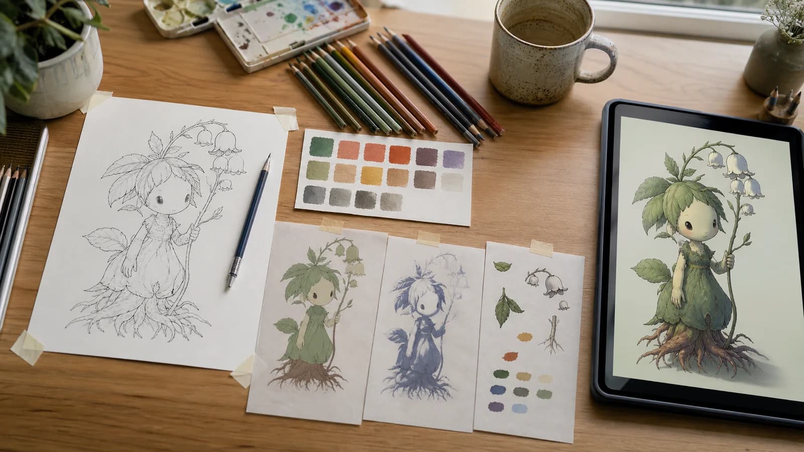
Give color a job instead of naming a mood

Separate flat colors, light direction, shadow family, and material behavior. A restrained plan is easier to review than a long list of poetic style words.

Illustrator desk with an original botanical line drawing, palette swatches, light studies, material notes, and a finished raster color preview

01

Prepare a readable source

Use a clear drawing with enough contrast to distinguish contours from paper texture. Crop away scanner borders, rotate the page correctly, and check that faces, hands, small props, and crossing lines remain understandable at the uploaded resolution. Closed contours can help automated fills, but this workflow generates a new image rather than running a deterministic flood-fill algorithm.

02

Name local colors before light

Assign the object colors first: jacket, skin, hair, foliage, metal, wall, and accent. Then add one key-light direction and one shadow family. This keeps “blue jacket under warm light” separate from “orange jacket,” which makes a weak result easier to diagnose.

03

Describe material evidence

Material words should change visible behavior. Matte cotton has broad soft value changes, glazed ceramic carries compact highlights, brushed metal has directional reflections, and translucent leaves pass some light. Ask for only the materials present in the drawing.

A five-step path to colorize line art

01

Check rights and clean the drawing

Upload only artwork you created or are authorized to transform. Remove unrelated notes, crop the page, correct rotation, and keep the important contours legible.

02

Upload one reference

Sign in and upload one JPG, PNG, or WebP. The upload becomes a public image URL used by the reference-image generation task; the route depends on configured storage or APIMart upload support.

03

Write the color brief

State what should stay recognizable, list local colors by object, define one light source, identify the shadow temperature, and name only the materials that matter.

04

Generate and compare

Submit the task and compare the 1024 × 1024 result with the source. Check line changes, facial structure, hands, props, color boundaries, light logic, and invented details.

05

Finish in an editor

Download the strongest interpretation, place it beside the original or under the line layer, rebuild editable flats, repair contours, paint edges, and prepare the actual delivery format.

Colorize line art prompt examples

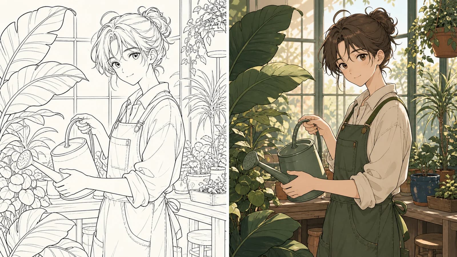
Original botanist line art beside a generated greenhouse color interpretation using sage, cream, terracotta, and warm window light
Before and proposed after: useful for judging palette and lighting, not evidence of exact line locking.

Botanical character in greenhouse light

“Keep the original botanist, watering can, greenhouse windows, and large leaf shapes recognizable. Colorize with sage foliage, cream cotton, a deep green apron, muted terracotta pots, and dark indigo accents. Warm window light from upper left, soft cool shadows, readable black contours, no extra objects or text.”

Why this direction is reviewable: The prompt separates preservation, local colors, one light direction, shadow temperature, and material cues. The result remains a visual proposal: compare the face, hands, watering can, window geometry, and every important contour with the uploaded drawing.

Flat colors before dramatic shading

“Preserve the line drawing and apply clean local colors first: cream shirt, rust scarf, charcoal trousers, teal bag, warm neutral skin, dark brown hair. Add only one broad cool shadow plane. Keep thin ink details readable and leave the background pale and simple.”

A production guide for colorizing line drawings

Open the section that matches the decision in front of you: source cleanup, palette, lighting, line preservation, troubleshooting, hand finishing, rights, or export.

Prepare line art that can survive a new interpretation

Begin with the source, not the prompt. A colorization system cannot reliably infer whether a faint mark is an eyelash, construction line, fabric fold, scanner dust, or background texture. Crop away page edges and unrelated notes, correct the rotation, and increase contrast only enough to make intended lines readable. If the drawing includes several characters or many overlapping props, test a representative crop first. The final result is square, so decide whether to pad, crop, or recompose a tall comic panel before uploading rather than letting an accidental crop remove the information you care about.

Closed shapes can make region boundaries easier to interpret, but do not mistake this workflow for a deterministic paint-bucket tool. Krita’s official Colorize Mask documentation describes a different, editor-based approach: users place color key strokes, update a mask, adjust gap handling, and can later convert or split the result into paint layers. Anime Maker instead sends a reference and prompt to a generative image-edit task. Use it when you want a color proposal; use a dedicated editor when exact boundaries and editable color islands are the requirement.

Inspect the generated interpretation before calling it colored art

Lines can move or disappear

The provider creates a new interpretation from the reference. Thin hatching, eyelashes, seams, fingers, tiny symbols, and overlapping contours may change. Compare at full size and repair production-critical lines manually.

The output is not layered

You receive one flattened 1024 × 1024 raster image. There are no separate line, flat, shadow, light, or material layers and no PSD document to continue editing non-destructively.

Transparency is not promised

The current task does not offer a transparent-background control. Ask for a simple background if separation matters, then create and inspect the mask in a dedicated editor.

One image per task

This page does not batch-process a folder, synchronize a palette across many drawings, or guarantee the same character colors across separate submissions. Maintain a real palette sheet and review each result.

Questions about how to colorize line art

How do I colorize line art on this page?

Sign in, upload one JPG, PNG, or WebP drawing, then describe the local colors, light direction, shadow family, materials, and features that should remain recognizable. Submit the task and compare the returned 1024 × 1024 raster interpretation with your source before downloading it.

Will the original lines remain exactly unchanged?

No. This is reference-guided image generation, not a deterministic fill beneath a locked line layer. Major composition and contours may carry through, while fine lines, hands, faces, textures, and small props can change. Keep the original file and restore critical linework manually.

Which line art produces the clearest result?

Use a correctly oriented, well-cropped drawing with clear contrast and readable shapes. Remove scanner borders and unrelated notes. Make sure small facial features, fingers, clothing seams, and overlapping objects remain understandable at normal view size.

Continue the illustration workflow

Turn a photo into an anime interpretationCreate an anime image from textDevelop an original anime characterPlan a comic image workflow

Turn one clean drawing into a color direction you can evaluate

Start with a readable source, three to six local colors, one light source, and material notes that can actually be seen.

Colorize this line art

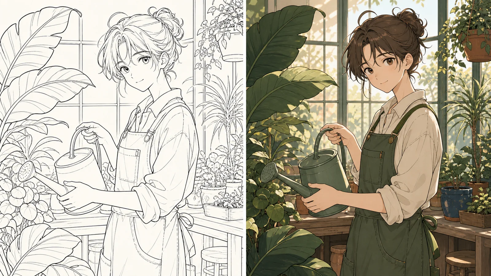
This editorial example shows the intended task: a line drawing supplies composition and recognizable contours; the generated side supplies a proposed palette, light, and material treatment. It does not prove pixel-for-pixel line preservation.

Why this direction is reviewable: A flat-first brief exposes wrong object colors before lighting makes them harder to see. It is a sensible first pass when the palette—not a finished illustration—is the decision under review.

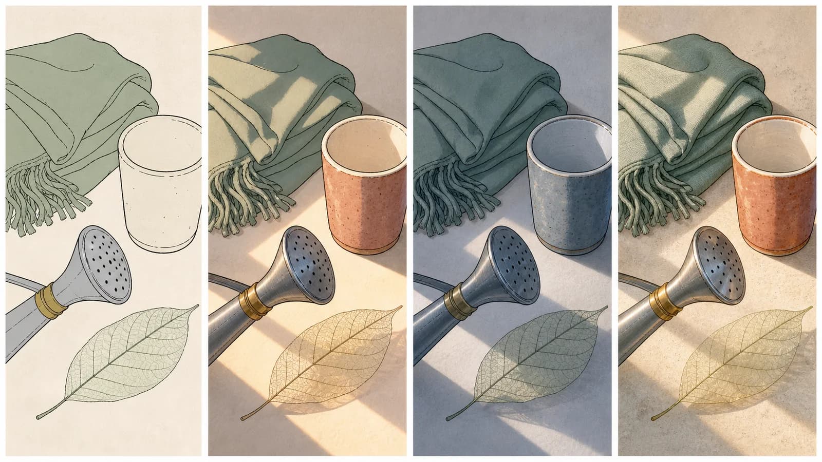
Four-panel color key showing flat colors, warm light, cool shadows, and material rendering on the same scarf, cup, metal nozzle, and leaf line art
A controlled study separates local color, light family, shadow family, and surface treatment.

Material-aware color key

“Use the same drawing and composition. Distinguish a matte woven scarf, glazed ceramic cup, brushed metal nozzle, and translucent leaf. Keep a sage, terracotta, cream, and indigo-gray palette. Use warm side light, restrained highlights, readable linework, and no labels.”

Why this direction is reviewable: The material request is tied to visible highlight shape, texture, and translucency instead of generic “detailed rendering.” Review whether the generator preserved object boundaries before borrowing its surface ideas.

Keep the original drawing unchanged in your project folder. Export a clean copy for upload and name it with a version number. If you adjust line weight, close gaps, erase construction marks, or crop the composition, record those changes. This makes it possible to tell whether a missing detail came from source preparation or generation, and it gives the colorist a stable line file to restore above the generated proposal during hand finishing.

Set local colors before asking for atmosphere

Local color is the base identity of an object before scene lighting changes its appearance. Write it by object: dark auburn hair, cream cotton shirt, desaturated teal bag, warm gray wall, brushed steel buckle. Avoid a loose string such as “warm cozy cinematic colors,” because it does not say which region owns which hue. Three to six main colors are usually enough for a first test. If the character already has an approved palette, use the same object-to-color mapping and keep accent colors small.

Flat colors are not an inferior result. They are a diagnostic stage. You can compare whether skin, hair, costume pieces, props, and background are separated correctly before shadows conceal boundary errors. Krita’s official flat-coloring guide likewise treats clean flats as a foundation and explains workflows for filling beneath line art and later splitting color regions. Anime Maker does not return those regions as layers, so a clear flat proposal is useful primarily as a visual key for manual rebuilding.

Do not encode every color as a hex value and expect calibrated reproduction. Display profiles, provider interpretation, surrounding light, and generated texture can shift appearance. Use ordinary color names plus relationships—“the scarf is darker and warmer than the shirt,” “the bag is the only saturated accent”—and keep a real swatch file outside the generator as the production source of truth.

Add one light source and a readable shadow family

After local colors are assigned, define where the main light comes from. “Soft window light from upper left” tells the result where lit planes and cast shadows should relate. Add a shadow family such as cool blue-gray or warm brown, but avoid requesting sunset, neon signs, moonlight, sparks, fog, rim light, and studio fill in one pass. Multiple competing sources can make the drawing harder to read and make color boundaries look inconsistent.

Value structure matters more than the number of effects. Squint at the result or view it in grayscale: can you still separate the face from the hair, hands from clothing, and the subject from the background? If not, change the value relationship before adding detail. A light object in shadow should not automatically become the same color as a dark object in light. Tell the prompt which distinction matters and review the actual image rather than assuming the words were followed.

Use cast shadows to explain form and contact. A hand should cast a plausible shadow on the object it holds; a figure standing on the floor needs grounding; a leaf in front of a face should affect the light. Generated images can create attractive but contradictory highlights. Treat them as proposals, then repair the lighting logic during paint-over.

Describe what makes each surface visibly different

Material direction works when it changes edges, highlight size, texture, and translucency. Matte cotton produces broad soft changes with little mirror reflection. Glazed ceramic can carry a compact highlight and a softened reflection. Brushed metal often has directional value bands. Worn leather shows creases and a controlled sheen. A translucent leaf may glow near a backlit edge. Name only materials already visible in the drawing so the generator does not invent props to satisfy a material list.

Keep material detail subordinate to line readability. Dense texture can cover thin hatching and redraw seams. If preserving ink is the priority, ask for restrained rendering, readable black contours, and simple broad material cues. Run a material-rich pass only after a flat-color pass has established the right object ownership. The four-panel editorial study on this page demonstrates that sequence: local colors, warm light, cool shadow, then a restrained surface pass.

Treat preservation as a review target, not a promise

Write the most important invariants in concrete terms: keep the face proportions, hand pose, clothing seams, watering-can silhouette, window grid, and major leaf contours recognizable. “Keep everything exactly the same” is not a control the provider can guarantee. Rank the features instead. If the face and hand gesture matter more than background hatching, say so and simplify the background request.

Compare source and result side by side at the same scale. Check the outer silhouette first, then landmarks, expression, finger count and grip, costume construction, props, and finally small texture. Overlaying the two files at reduced opacity in an editor will reveal drift quickly. Do not accept a beautiful result if it quietly changes the storytelling action or the identity of a commissioned character.

For a production illustration, place the original line art above the generated color proposal and test a Multiply blend or other suitable compositing method in your editor. Adobe’s official layers documentation explains that layers separate components so they can be changed without altering the rest of the image. That editable separation is precisely what the generated flattened image does not provide. Rebuild the color and lighting on dedicated layers if later revisions matter.

Diagnose failure before rewriting the entire prompt

If color crosses a boundary, inspect the source for a gap, faint contour, or ambiguous overlap. If the face changes, reduce style language and repeat only the essential facial landmarks. If the palette drifts, map colors to named objects and remove extra mood words. If the image becomes too painterly, ask for clean flats, restrained cel shading, and readable ink contours. If the background takes over, lower its detail and contrast rather than adding more instructions to the character.

Change one variable per test and keep a short log: source version, prompt version, what remained correct, largest mismatch, and next change. A failed result does not justify replacing every color, light, material, and preservation instruction simultaneously. Controlled comparison turns generation into art direction; uncontrolled rewriting produces attractive samples with no reliable lesson.

Some failures are workflow failures rather than art failures. The upload requires sign-in and accepts JPG, PNG, or WebP within the server file limit. Reference tasks require a public URL and APIMart image configuration. A missing-reference error means no image was attached; a “not configured” response means the server cannot run this reference workflow. Repeated prompting cannot repair missing service configuration.

Rebuild editable color instead of shipping the first raster

Use the generated image as a color key, paint-over base, or conversation artifact. For production, bring the original lines and chosen result into an illustration editor. Build separate layers for flats, shadows, light, effects, and corrections. Restore line weight and facial landmarks from the source, clean edge halos, correct hands and props, and remove any accidental marks. If a client needs revisions, this structure is far more useful than a single merged image.

Check the image at its delivery size. Thin lines that look elegant at 200% may disappear in a thumbnail; subtle shadow differences may collapse on a phone. Test grayscale, mirrored view, and a contrasting background. Add exact text, logos, and accessibility copy outside the generated art. If transparent output is needed, create a deliberate mask and inspect fine edges rather than assuming the background is removable.

Example: color-key approval for an illustrated greenhouse scene

A small editorial team has an approved black-and-white drawing of a botanist in a greenhouse. The deadline decision is not final rendering; it is whether the character should wear a deep green apron, whether terracotta can balance the foliage, and whether warm morning light keeps the face readable. The team uploads a cleaned copy, asks for those local colors and one upper-left light, and requests that the face, watering can, window grid, and large leaf shapes remain recognizable.

The returned image gives the art director a concrete color conversation. The team rejects a changed hand grip and an invented hanging plant, but keeps the sage–terracotta relationship and warm reflection on the watering can. A colorist then rebuilds the flats under the original line layer, paints a simpler shadow family, and corrects the face. In this case the generator saved exploration time without becoming the production source file. That is a realistic success criterion for reference-guided colorization.

Color only drawings you are allowed to transform

Possessing an image file does not automatically grant permission to create and publish a derivative color version. Use your own drawing, commissioned work with suitable rights, licensed material, or a source for which you have explicit authorization. Keep the creator, source date, permission, project purpose, and uploaded version together. Do not remove a signature to disguise authorship, and do not use this page to recolor a known character for a commercial release without a rights review.

The U.S. Copyright Office’s 2025 Copyright and Artificial Intelligence, Part 2 report explains that copyrightability of AI-assisted output depends on human authorship and is assessed case by case in the United States. It discusses human-authored inputs, selection, arrangement, and modification rather than treating prompts alone as automatic authorship. Other jurisdictions differ. Preserve the original drawing, prompt, chosen output, repaint layers, and decision notes, and obtain qualified advice when the release is consequential.

Further reading for an editable coloring workflow

Krita Manual — Colorize Mask: https://docs.krita.org/en/reference_manual/tools/colorize_mask.html. This documents key strokes, gap handling, edge detection, mask updates, conversion to a paint layer, and splitting colors. Krita Manual — Flat Coloring: https://docs.krita.org/en/tutorials/flat-coloring.html. This compares editor-based flatting methods and emphasizes correcting the final regions. These sources describe Krita, not Anime Maker, and are useful when exact editable regions are required after concept exploration.

Adobe Photoshop — Layers overview: https://helpx.adobe.com/uk/photoshop/desktop/create-manage-layers/get-started-layers/layers-overview.html. It explains why separate image, fill, adjustment, type, and shape layers support non-destructive changes. U.S. Copyright Office — Copyright and Artificial Intelligence: https://www.copyright.gov/ai/. Use these references to plan the hand-finishing and records that a single flattened generated image cannot supply.

Configuration can block the task

Reference-image generation requires a public reference URL and working APIMart image configuration. If upload or generation reports that reference images are not configured, the task cannot be completed until the service is configured.

A polished image can still be wrong

Plausible light can hide changed anatomy, missing props, merged regions, or an unapproved redesign. Judge accuracy and usefulness against the source and project brief, not surface finish alone.

Should I ask for flat colors or a finished render?

Start with flat local colors when palette is the main decision. Add one key light and one shadow family only after object colors are clear. A restrained first pass is easier to compare, repaint, and translate into editable layers than a heavily rendered result.

Can it return a layered PSD or separate color regions?

No. The result is one flattened square raster image. For editable production work, recreate flat selections and separate line, base color, shadow, light, and effects layers in Krita, Photoshop, Clip Studio Paint, or another illustration editor.

Can I colorize many pages at once?

No batch tool is exposed on this page. Submit one reference per task. For a comic or animation sequence, maintain a palette sheet and lighting key, test one representative drawing, then process and review each additional image individually.

Does it create a transparent background?

A transparent-background option is not part of this workflow. Request a simple, contrasting background if needed, then make a mask and inspect the edge in an editor. Fine hair, translucent objects, and soft shadows need particular care.

Why did color leak across a boundary?

Open contours, dense crossings, faint lines, paper texture, and ambiguous overlaps can make regions hard to interpret. Strengthen the source line, close important gaps, simplify the prompt, and state which object owns each color. Regenerate one controlled test before adding more rendering instructions.

Can I use the result commercially?

Commercial use depends on your rights in the uploaded drawing, the active provider and plan terms, your human contribution, and the law where you publish. Use authorized sources, keep your original and edit record, inspect accidental resemblance, and seek legal advice for consequential releases.