2026/07/26
Types of Manga Speech Bubbles: A Practical Guide
Learn the main types of manga speech bubbles, what each shape implies, and how to place, letter, translate, and check them without confusing readers.
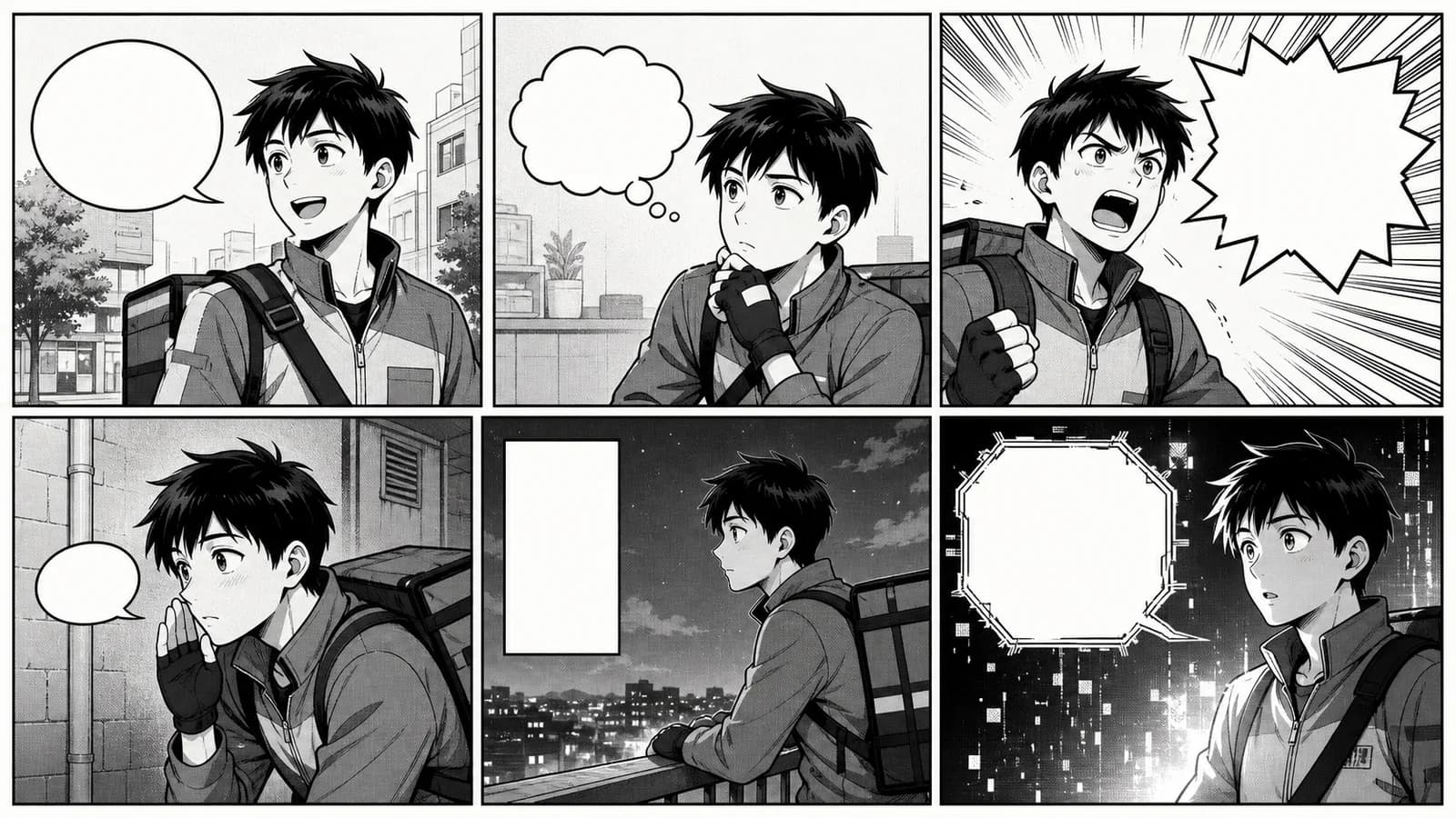
The main types of manga speech bubbles are ordinary dialogue balloons, thought bubbles, whisper balloons, shout or burst balloons, narration boxes, and special-effect balloons for distorted, electronic, telepathic, or off-panel voices. Shape gives the reader an early clue, but it cannot carry the scene alone. Tail direction, placement, lettering, panel context, and a consistent visual grammar decide whether the line reads as speech, thought, volume, distance, or a change of voice.
This guide is for manga artists, comic letterers, storyboarders, translators, teachers, and small creative teams. It explains what common balloon forms communicate, where conventions overlap, and how to build a page that remains clear at phone size. It also shows where Anime Maker can help: the Manga Speech Bubble Generator can create a visual reference or concept image from a prompt, but it does not add editable, proofread dialogue to an uploaded page. Final balloons and text still belong in a drawing or layout editor.
Quick rule: choose the least dramatic bubble that communicates the voice, aim its tail unmistakably, place balloons in reading order before polishing the art, and add final text only after the dialogue has been edited.
In this guide
- Manga speech bubble types at a glance
- Ordinary dialogue balloons
- Thought bubbles and inner monologue
- Whisper and quiet-voice balloons
- Shout, scream, and burst balloons
- Narration boxes and captions
- Electronic, supernatural, and distorted voices
- Tails, linked balloons, and off-panel speech
- How to place speech bubbles
- A practical lettering workflow
- Accessibility and translation
- Frequently asked questions
Manga speech bubble types at a glance
There is no universal codebook that forces every artist to use exactly the same shape. Genres, publishers, reading traditions, and individual visual styles differ. Treat the following table as a working grammar: it describes common expectations, then asks you to confirm them through the scene.
| Bubble type | Common visual form | Usually communicates | Main risk |
|---|---|---|---|
| Ordinary dialogue | smooth oval or rounded shape with a tail | normal spoken voice | too many decorative variations weaken consistency |
| Thought | cloud-like bubble with small circles, or untailed inner-monologue text | private thought | readers may mistake it for dreamy speech or narration |
| Whisper / quiet voice | smaller, lighter, dashed, or thin-outline balloon | low volume, hesitation, breathiness | tiny lettering becomes unreadable |
| Shout / scream | jagged burst, sharp contour, heavier outline | sudden volume, alarm, anger, impact | overuse makes every line feel equally loud |
| Narration / caption | rectangle without a speech tail | time, place, exposition, narrator, internal caption | unclear ownership when first-person voice changes |
| Electronic / radio voice | angular, geometric, doubled, or mechanically treated contour | mediated or synthetic sound | effect obscures the words or resembles shouting |
| Supernatural / altered voice | irregular, smoky, black, broken, or custom contour | nonhuman presence, possession, telepathy, distortion | style becomes decorative without a stable meaning |
| Off-panel speech | standard balloon whose tail points beyond the panel | speaker is nearby but outside the frame | tail appears to point at the wrong visible character |
The most reliable choice is often the plain oval. Use a special shape when the reader needs special information before or while reading the sentence. If the line already says “I can barely whisper,” a tiny pale bubble may reinforce the moment; five separate effects will only repeat it.
1. Ordinary dialogue balloons
A smooth speech balloon with a clear tail is the default for spoken dialogue. It should disappear into the reading experience. The outline contains the words, the white space protects them from the art, and the tail identifies the speaker.
Start with an oval or gently hand-drawn rounded form. Leave more breathing room at the sides than above and below so the text block does not look pinched. Centering every line mechanically can create awkward gaps; shape the line breaks so the text mass resembles a compact diamond or soft oval.
Use the ordinary balloon for calm speech, jokes, questions, routine conversation, and most exposition delivered aloud. A smooth balloon can still contain an angry sentence. Facial expression, posture, wording, and bold emphasis may already convey the mood. Changing the contour is useful only when the sound itself changes.
Scene example: A station clerk says, “The last train left ten minutes ago.” A regular oval lets the information land plainly. If the same clerk suddenly sees a ghost on the platform, a burst balloon for “Behind you!” marks a real shift in volume and urgency.
2. Thought bubbles and inner monologue
The familiar thought bubble has a cloud-like outline and a trail of small circles leading toward the thinker. It signals words that are not spoken. This form remains immediately understandable in many contexts, especially in comedy, children’s work, and retro-inspired layouts.
Contemporary manga and comics also present inner monologue without a cloud. The text may sit in a rectangular caption, float over the art without a tail, or use a distinct type style. None of these choices is automatically better. The page needs one repeatable distinction between speech the other characters can hear and thought they cannot.
Choose the system before the scene becomes complicated:
- use cloud bubbles only for short, immediate thoughts;
- use caption boxes for a reflective first-person voice;
- use uncontained text for an intimate or fragmented interior voice;
- do not switch among all three unless each form has a defined story job.
Scene example: A courier tells a customer, “Your parcel is intact,” in an ordinary balloon. Her private thought—“It has been growling for six blocks”—appears in a cloud bubble. The contrast creates the joke. If both lines use the same oval, readers may assume she said the dangerous part aloud.
3. Whisper and quiet-voice balloons
Whispers are often shown with a smaller balloon, a thinner or broken outline, lighter lettering, or more white space around a short line. These are conventions, not fixed laws. The goal is to lower the visual pressure without lowering readability.
Do not make the type so pale or small that the reader has to zoom. A whisper can be quiet in the story and still meet the same legibility standard as normal dialogue. Shorten the line, reduce the balloon’s visual weight, and let the character’s pose carry part of the information: a hand beside the mouth, a close lean, or a guarded glance.
A weak or fading voice may use an uneven boundary, trailing ellipsis, or increasingly sparse words. Reserve that treatment for a meaningful change. If every shy character receives dashed balloons in every panel, the device can turn into visual noise.
Practical test: export the page at its expected display width. If the normal speech reads but the whisper does not, revise the whisper. “Quiet” describes the fictional sound, not permission to hide the sentence from the audience.
4. Shout, scream, and burst balloons
A jagged or starburst contour creates visual pressure. Sharp points, a thicker border, bold lettering, and extra surrounding action lines can suggest shouting, panic, impact, a public announcement, or an abrupt interruption.
Match the degree of distortion to the sound. A firm command may need a slightly angular outline and one bold word. A scream at the climax may justify a large burst that overlaps the background. When both receive the maximum effect, the page loses its volume range.
Leave safe space between the letters and the inward points of the burst. A dramatic contour that cuts into the text fails its basic job. Also check the tail: a large burst can dominate the panel so completely that readers no longer know who shouted.
Use contrast rather than constant intensity. Three plain balloons followed by one burst feel loud. Four consecutive bursts feel normal. This is the same pacing principle used for close-ups and black fills: emphasis needs a quieter baseline.
5. Narration boxes and captions
Rectangular boxes commonly carry information that is not tied to a visible mouth: time, location, scene transitions, an external narrator, a diary excerpt, or first-person inner narration. Because a caption normally has no speech tail, its owner must be clear through wording, styling, or prior context.
Separate three jobs that are often mixed together:
- Editorial orientation: “Three days earlier” or “North platform.”
- External narration: a voice outside the immediate cast describes events.
- Character narration: a named or established character reflects on the scene.
If a page uses all three, assign a stable visual distinction. A plain rectangular box may handle time and place; a lightly tinted box may belong to the protagonist’s journal. Avoid changing colors alone when the work will also appear in grayscale. Border, icon, type treatment, or phrasing can supply a second cue.
Captions should not describe what the panel already shows. “She opens the door” adds little when the door opening fills the image. A better caption supplies unavailable information: “The lock had been changed that morning.”
6. Electronic, supernatural, and distorted voices
Robots, radios, masks, loudspeakers, ghosts, telepathy, dreams, and possessed characters often receive custom balloons. Angular geometry can imply a device. A doubled outline may suggest amplification. A black balloon with light lettering can create an alien or ominous contrast. A wavering boundary may imply an unstable voice.
First define the story rule in words: this shape means a voice heard through the helmet, or this black balloon belongs only to the river spirit. Repeat the rule consistently. The reader learns the association through use, not through a legend printed beside every panel.
Do not rely on the contour alone for a critical plot fact. Introduce the source visually or verbally at least once. A radio grille, headset reaction, glow, or nearby sound effect can establish that the line is mediated. Later pages can use the balloon more economically.
Lettering effects need restraint. Tracking letters far apart, rotating words, stacking outlines, or reducing contrast may look appropriately strange at full zoom but collapse on a phone or in print. Keep the sentence readable first; put most of the distortion in the edge, fill, or surrounding art.
7. Tails, linked balloons, and off-panel speech
The tail is a small mark with a large responsibility. Its tip should point toward the speaker’s mouth area or clearly identify the character without touching the face. When two characters stand close together, a vague tail aimed between them creates an avoidable puzzle.
Clip Studio Paint’s official Balloons manual treats balloons, tails, curves, widths, and control points as editable elements. That editability matters: move the balloon or redraw the tail after the panel composition changes instead of accepting a misleading connection.
Common tail arrangements include:
- standard tail: points to a visible speaker;
- off-panel tail: exits the frame toward a nearby unseen speaker;
- thought trail: small circles lead toward the thinker;
- broadcast tail: points toward a phone, speaker, helmet, or radio source;
- joined balloons: two or more connected shapes divide one speaker’s line into beats;
- interrupted chain: a second balloon or another speaker cuts into the first line.
Join balloons when one speaker pauses, changes tack, or delivers two related beats. Do not create a chain merely because the sentence did not fit. Edit the line first. When alternating speakers, separate their balloons clearly; joined shapes usually imply one continuous voice.
8. How to place speech bubbles
Balloon placement starts before finished drawing. It is a reading-order problem and a composition problem at the same time. For left-to-right editions, readers generally expect the upper-left balloon first; traditional Japanese manga often follows a right-to-left page and balloon order. Build the intended order into the thumbnail rather than mirroring a finished page later.
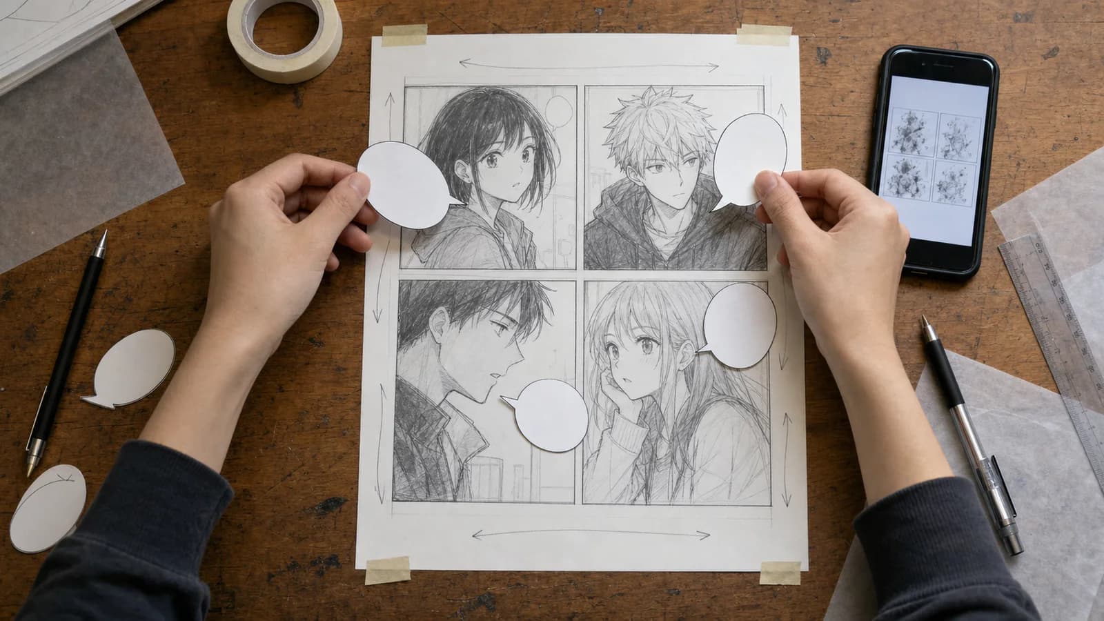
Place the words before facial details
Write the rough dialogue, draw approximate balloons, then position faces, hands, and key props around them. This prevents the common late-stage choice between covering an expression and shrinking the type. Preserve clear space around each balloon; crowding three contours against a panel edge can make separate lines look like one cluster.
Use a visible zigzag path
In a conversation, arrange balloons so the eye can step from the first speaker to the second without doubling back. Top-to-bottom position usually overrides small horizontal differences. Avoid placing the second line above the first just because it fits an empty corner.
Keep the speaker connection short and clear
Long crossing tails slice through the artwork and can intersect other balloons. Move the balloon closer to its speaker, change the crop, or reorder the figures. If an off-panel speaker enters the conversation, point the tail decisively beyond the frame.
Check gutters and trim
Keep essential text away from panel borders, the book gutter, and trim risk. Clip Studio Paint’s official Frames and Panels guide exposes separate horizontal and vertical gutter controls, which reflects a useful production principle: panel gaps and balloon spacing are deliberate layout values, not leftovers.
Test without artwork
Hide the art layer and read only the balloons. The conversation should still progress in the intended order, and each tail should preserve speaker ownership. Then hide the words and inspect the art: the actions should remain understandable without explanatory dialogue.
9. A practical lettering workflow
Use the following sequence for a four-page scene or a short webcomic episode:
| Pass | What you decide | What remains editable |
|---|---|---|
| 1. Script edit | speaker, intent, line length, interruption | every word |
| 2. Thumbnail | balloon order, approximate size, speaker positions | panel and balloon geometry |
| 3. Shape grammar | ordinary, thought, whisper, burst, caption, special voice | contour and tail system |
| 4. Art draft | faces, gestures, props, negative space | local composition |
| 5. Lettering | font, line breaks, emphasis, balloon fit | text and vector balloons |
| 6. QA | order, ownership, spelling, phone-size legibility | corrections before export |
A concrete scene: four speakers in a repair shop
Imagine a mechanic, an apprentice, a customer on a phone, and a small service robot in one panel sequence.
- The mechanic uses ordinary oval balloons.
- The apprentice whispers a warning in a smaller thin-outline balloon.
- The phone customer uses a slightly angular balloon whose tail points to the handset.
- The robot uses a compact geometric outline established in its first appearance.
- A rectangular caption marks “Closing time,” not a character’s speech.
The system creates five voices without five fonts. If the mechanic shouts when the machine sparks, the temporary burst has impact because her normal voice was plain. If the robot later speaks through the building’s public-address system, keep its geometric contour and change the tail source to the ceiling speaker; the reader retains identity and learns location.
The Manga Speech Bubble Generator can help explore a reference image for this contrast: describe the intended voice, contour, mood, blank interior, and reading direction. Treat the output as a visual draft. It produces a raster image rather than editable balloon vectors, and generated lettering may be inaccurate. Rebuild the chosen system in your editor and type the approved dialogue there.
If you are designing the surrounding sequence, the Comic Strip Maker can help draft a compact 3–4 panel visual concept, while the AI Manga Generator can explore a black-and-white manga scene. Neither tool replaces page-level lettering, continuity checks, or an editable production file. For recurring cast design, establish visual anchors with the Anime Character Generator, then preserve your own reference sheet.
Pre-export speech bubble checklist
- Every special shape has a defined meaning.
- Plain dialogue remains the default.
- Each tail identifies one speaker or sound source.
- Balloon order matches the edition’s reading direction.
- No balloon covers a required face, hand, clue, or action.
- Lines were edited before the font was reduced.
- Whispered and distorted voices remain readable at delivery size.
- Captions add information instead of narrating visible action.
- Spelling, punctuation, names, and line breaks were checked separately.
- The editable master keeps art, text, and balloons on recoverable layers.
10. Accessibility and translation
A comic posted online is still an informative image. The W3C Web Accessibility Initiative’s Images Tutorial says informative images need text alternatives that convey their essential information and advises against images of text when ordinary, adaptable text can provide the same content. For a manga page, a character list is not enough; the alternative should preserve the meaningful action and dialogue sequence.
When a platform offers a short alt field, describe the panel’s key event and provide a visible transcript nearby for the full conversation. Keep the transcript in reading order and name speakers. Do not encode “whisper” only through pale type; include it in the transcript where it changes meaning.
Translation requires relettering, not replacing words one for one. A translated line may expand, contract, or need a different break to preserve the beat. Keep source dialogue outside the flattened artwork, allow balloons to resize, and check every edition at its actual reading direction. Sound symbolism and balloon conventions also vary by market, so a local letterer or editor should review unusual effects.
For a right-to-left edition, do not simply mirror finished pages. Handedness, signs, clothing fasteners, action direction, and spatial clues may become wrong. Return to the thumbnail, reorder balloons deliberately, and redraw tails. The visual joke or reveal should still arrive at the intended moment.
Frequently asked questions
What are the main types of manga speech bubbles?
The most common types are ordinary dialogue balloons, thought bubbles, quiet or whisper balloons, jagged shout balloons, rectangular narration boxes, and custom balloons for electronic, supernatural, telepathic, or distorted voices. Off-panel speech usually uses a normal balloon whose tail exits toward the unseen speaker.
What does a jagged speech bubble mean in manga?
A jagged or burst-shaped balloon usually signals increased vocal pressure: shouting, screaming, shock, anger, an announcement, or a sharp interruption. Context still decides the exact meaning. Use it against calmer shapes so the volume change feels intentional rather than permanently loud.
What is the difference between a thought bubble and a narration box?
A thought bubble usually represents a character’s immediate private thought and often uses a cloud outline or thought trail. A narration box can carry time, place, an external narrator, or longer first-person reflection. Whichever system you choose, keep ownership clear and apply it consistently.
Where should manga speech bubbles go?
Place balloons in the edition’s reading order before finishing the art. Keep earlier lines higher, maintain a clear zigzag path, point tails unambiguously, protect faces and clues, and stay away from trim and gutters. Test the page at its actual print or phone size.
Should I draw the art or add the speech bubbles first?
Plan rough balloons during thumbnailing, before detailed drawing. You can refine their shapes later, but reserving the text area early prevents covered faces and tiny lettering. Final dialogue, balloons, and tails should remain editable until proofreading and localization are complete.
Can Anime Maker add final dialogue to my manga page?
No. Anime Maker can generate a visual reference or concept image based on your prompt, including speech-bubble ideas, but it does not place editable, proofread text onto an uploaded manga page. Add exact dialogue and rebuild balloon shapes in a drawing or layout editor.
Build a speech-bubble system readers can learn
Understanding the types of manga speech bubbles is not about collecting as many contours as possible. It is about giving each visible choice a stable job. Start with ordinary speech, add one form for thought and one for narration, then introduce special voices only when the story needs them.
Plan balloons with the thumbnail, not after the finished faces. Read the text-only layer, inspect every tail, test at delivery size, and keep the master editable for corrections and translation. When you need to compare directions before lettering, use the Manga Speech Bubble Generator for visual exploration—then make the final words, shapes, and reading order your own.
References
- CELSYS, Clip Studio Paint User Guide: Balloons — editable balloon shapes, tails, layers, and control points.
- CELSYS, Clip Studio Paint User Guide: Frames and Panels — panel division and gutter controls.
- W3C Web Accessibility Initiative, Images Tutorial — informative images, images of text, and text alternatives.
Author

Categories
In this guideManga speech bubble types at a glance1. Ordinary dialogue balloons2. Thought bubbles and inner monologue3. Whisper and quiet-voice balloons4. Shout, scream, and burst balloons5. Narration boxes and captions6. Electronic, supernatural, and distorted voices7. Tails, linked balloons, and off-panel speech8. How to place speech bubblesPlace the words before facial detailsUse a visible zigzag pathKeep the speaker connection short and clearCheck gutters and trimTest without artwork9. A practical lettering workflowA concrete scene: four speakers in a repair shopPre-export speech bubble checklist10. Accessibility and translationFrequently asked questionsWhat are the main types of manga speech bubbles?What does a jagged speech bubble mean in manga?What is the difference between a thought bubble and a narration box?Where should manga speech bubbles go?Should I draw the art or add the speech bubbles first?Can Anime Maker add final dialogue to my manga page?Build a speech-bubble system readers can learnReferences
More Posts
Production guides
Anime Camera Angles: A Practical Storytelling Guide
Plan anime camera angles that clarify story, emotion, and screen direction. Compare shot sizes, build a shot list, and write prompts you can test.
Production guides
Comic Panel Layout Guide: Control Flow and Pacing
Use this comic panel layout guide to plan readable grids, gutters, focal panels, dialogue space, page turns, and mobile-friendly story flow for print or phone.
Production guides
Comic vs Manga vs Manhwa: A Practical Comparison
Compare comic vs manga vs manhwa by publishing tradition, reading direction, color, layout, serialization, workflow, and the format your story needs most.
Newsletter
Join the community
Subscribe to our newsletter for the latest news and updates